Interactive Dashboards
Now it’s time to put some of your visualizations together into an interactive dashboard. In this section I’ll walk you through the very basics of putting visualizations together and adding interactivity.
Note: There are a lot of best design principles that go into creating dashboards like color choices, fonts, layout, icons, and format. I’m not going to go over these, I’m just going to show you the very basics to start you on your way. I’m not going to go into detail about layout details or tiling. If you’d like to learn more about making beautiful and cohesive dashboards check the following blogs and tutorials as a start:
Layout Containers - Joe Beaven
Design Secrets for Non-Designers Session: Chantilly Jaggernauth and Blog
Dashboard Design - Bridget Cogley
Let’s start!
Click the button next to the “New Worksheet” button (circled below). This is the “New Dashboard” Button
Here we have our dashboard workspace. On the left you can adjust your dashboard size, you can drag in several sheets, and you can bring in layout containers (see the blog above), text boxes, images, extensions, and more.
First I’ll show you how to bring in sheets and add interactivity, and then I’ll give you a quick peek at layout containers. Again, I’d highly advise reading the blogs and sessions I linked above to get into detail of layout and design.
I’m going to adjust my width to 1500, and bring in my Line Chart, Symbol Map, and Customer Sales. When you drag each of these sheets in, you’ll notice that the area that you’re dragging it to will grey to highlight the location. Practice dragging and dropping your sheets in different locations to see how it changes.
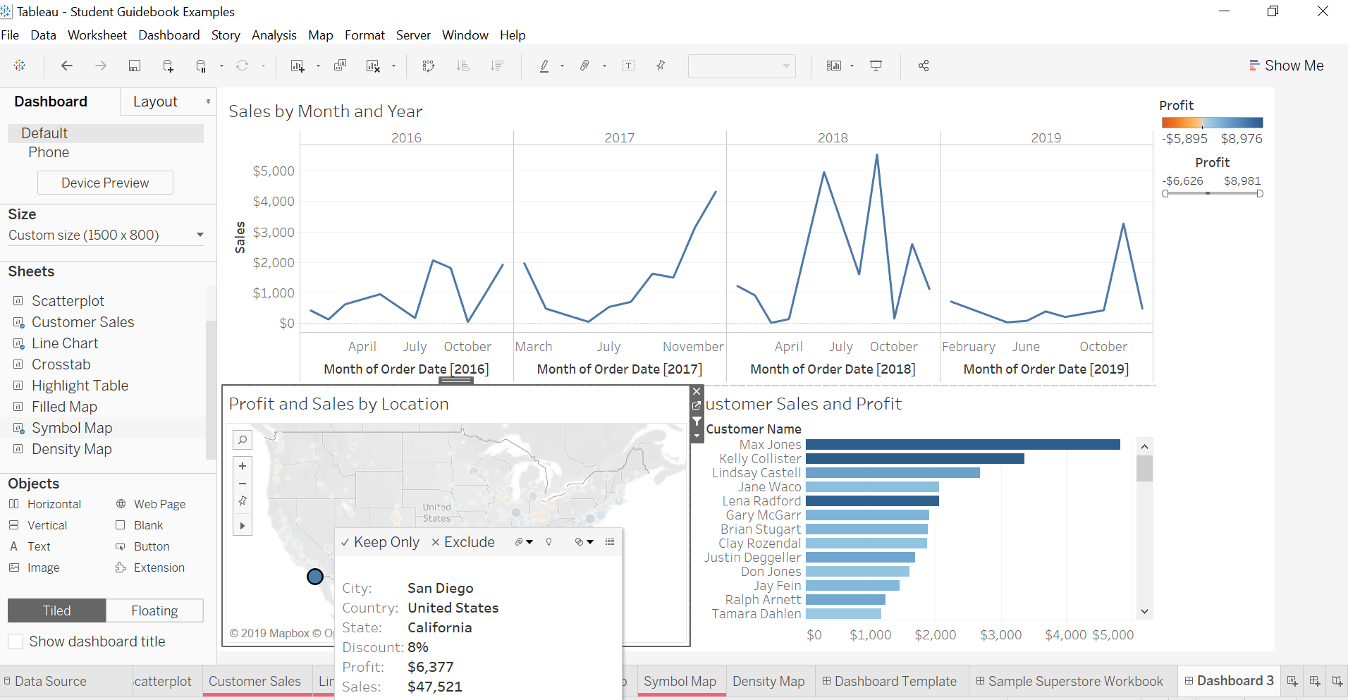
Here I dropped my line chart at the top, my symbol map at the bottom left, and my customer sales at the bottom right. My filters are automatically brought in. I already changed the titles here, but you can double click the titles to change the words, fonts, sizing, or colors. If you want, you can also drop in a text box at the top to give our dashboard a title.
Here we have a nice dashboard showing us three views. What if we want to dig a little deeper? That’s where we can use Tableau’s filter features.
First let’s go to the profit filter and use the filter slider. Notice how it only impacts Customer Sales and Profit sheet? We can make it impact other sheets as well! Click the carat on the filter and click on “Apply to Worksheets”.
Click on Selected Worksheets and select “Symbol Map” as well. Now if you use the filter you’ll notice that it also changes the symbol map!
There’s another way filters can be used in dashboards. You can have sheets filter each other. What do I mean by that? Try click around on a customer bar chart, or a bubble on the map. It doesn’t do anything yet.
If you click on a worksheet and click the little filter icon, it will now filter the other worksheets. Click on the map’s filter icon.
Now if you click on any of the bubbles on the map, it will filter the customer sheet and the line chart!
So here you can see more detailed view of San Diego specifically. Looks like our top customers in San Diego are making us a big profit!
You can add KPI’s, more filters, better colors, descriptions, and more to your dashboard. The creativity and design is in your hands! Check out Chris Love’s “Everyday Dashboards” for inspiration.
If you want to learn about layout containers which give your dashboards a cleaner look, read Joe Beaven’s blog post on them.
Here’s an example of a Workout Wednesday I did for week 51 of the challenge, which was inspired by Pradeep Kumar’s dashboard. Here I don’t use any layout containers, but you can see that everything has a nice, clean layout.
If you wish to have more flexibility with the placement of your sheets, you can set everything to “floating” and drag and drop your worksheets wherever you like.


